Recto Verso
The launch of a new sportswear brand, made in Belgium
- Graphic & interior design
- Campaigns and productions
- Marketing strategy
- PR and influencer relations
- Brand activations & events
- Digital & social media
360 PROJECT
For Nightingale, the challenge was simple: there was a brand name, and a logo design. But with no experience in brand repositioning, art direction or marketing, Liebaert looked at the Benelux agency to help them launch and communicate the brand in Belgium. Additional tasks like art direction, decisions in branding strategy, content creation and creating a communication strategy were also included in this brand exercise.
The communication strategy created by Nightingale acted twofold: one as a means to engage journalists to spread the word in print and online, but also to communicate directly to the consumer through social media.
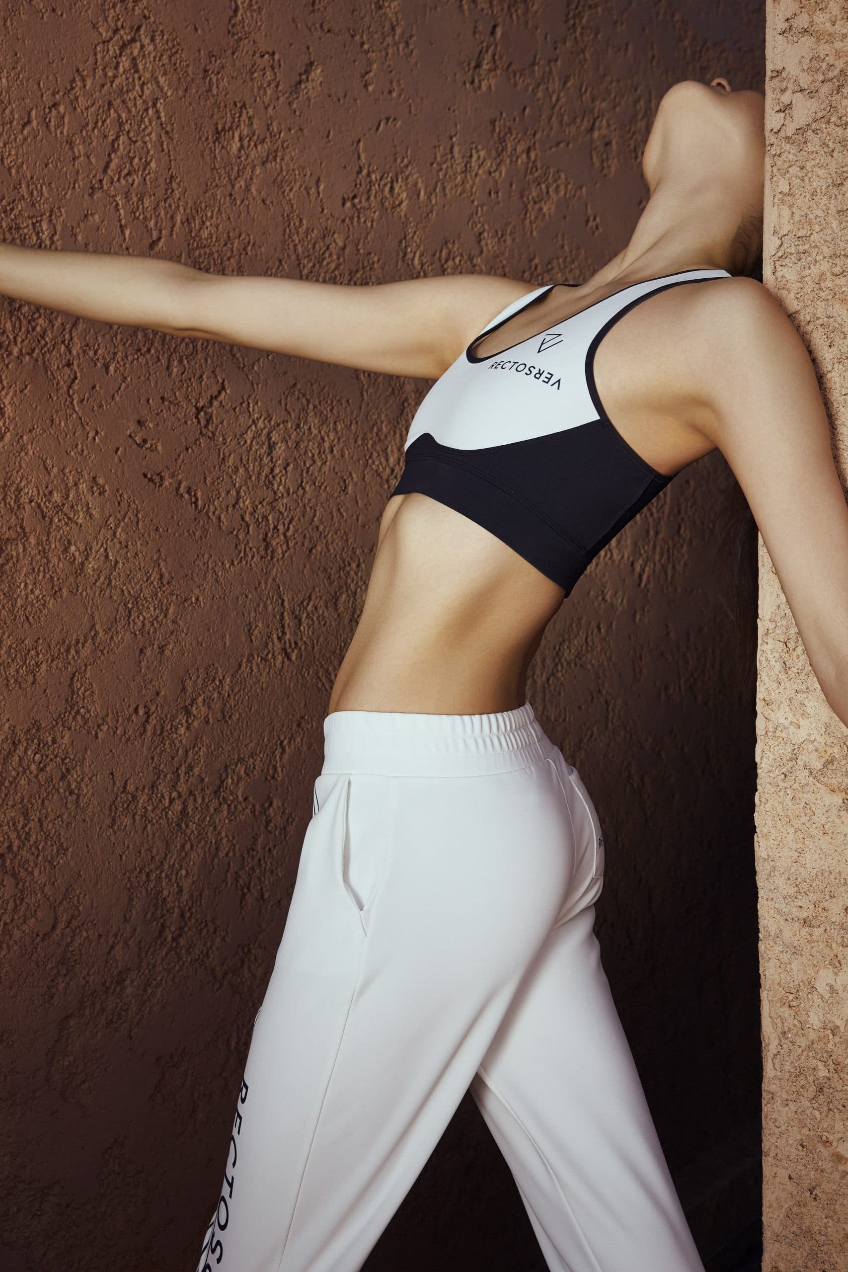
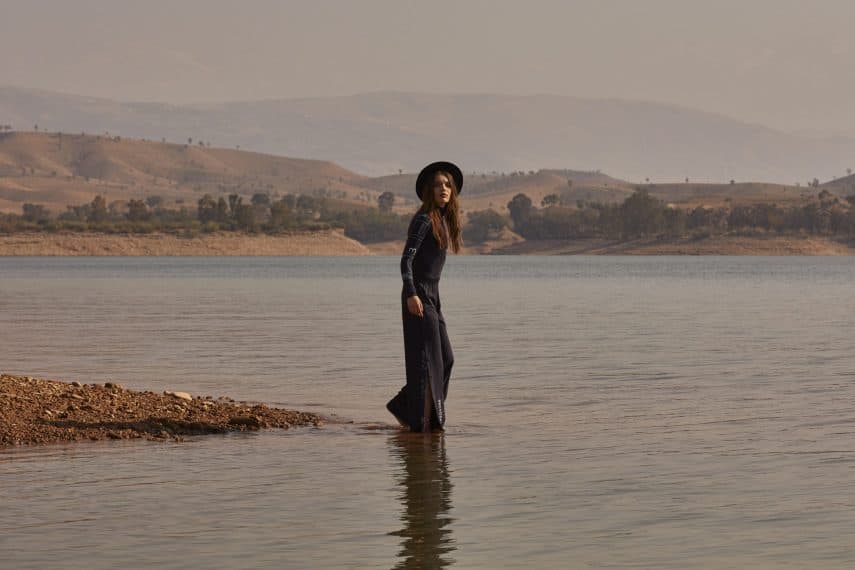
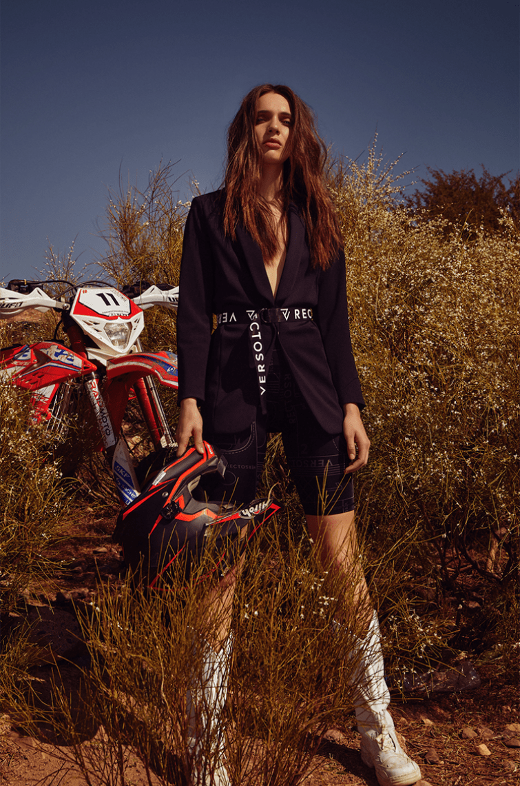
MARRAKECH TRIP
Following a press trip to Marrakech to introduce the brand, which coincided with the lookbook and campaign production, Nightingale managed to sustain a momentum that would live beyond the launch of the brand’s website and pop-up store one month later.
BRANDING & ART DIRECTION BY NIGHTINGALE
Beyond developing an internal document for branding and art direction, Nightingale designed the packaging and corporate identity for Recto Verso.
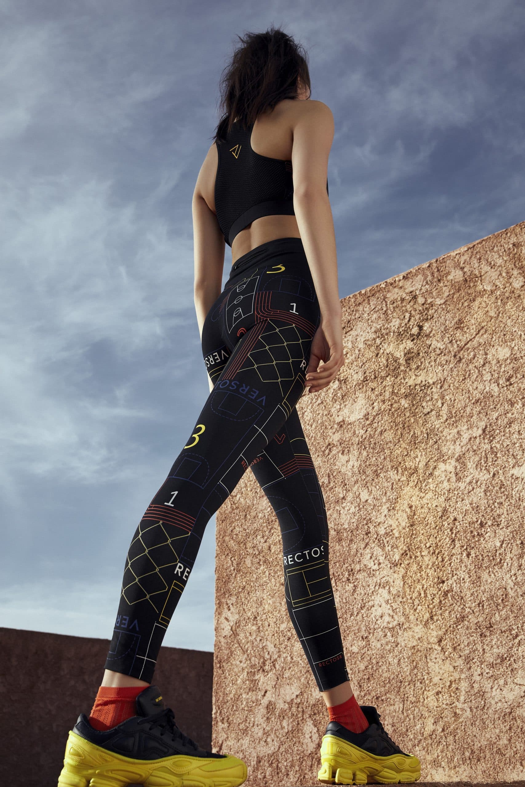
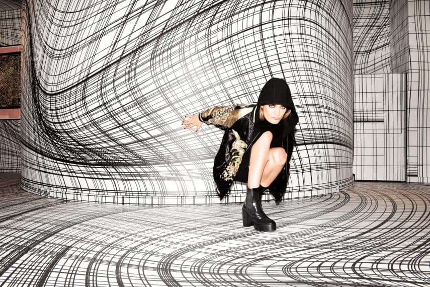
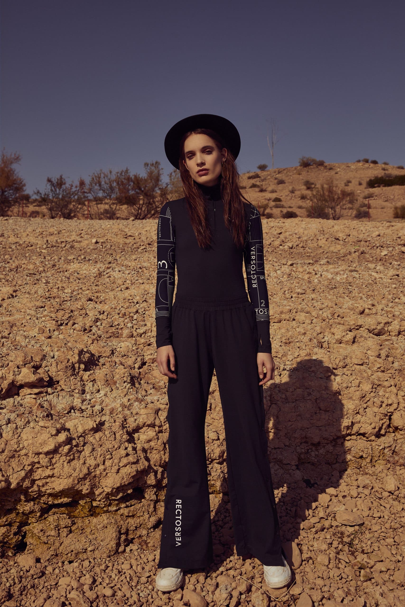
CAMPAIGN FOR COLLECTION ONE
Under the moniker of Collection One, the collection and three sublabels were teased and communicated through social media and the press. For this collection, Nightingale produced and directed the lookbook and campaign imagery in Marrakech.
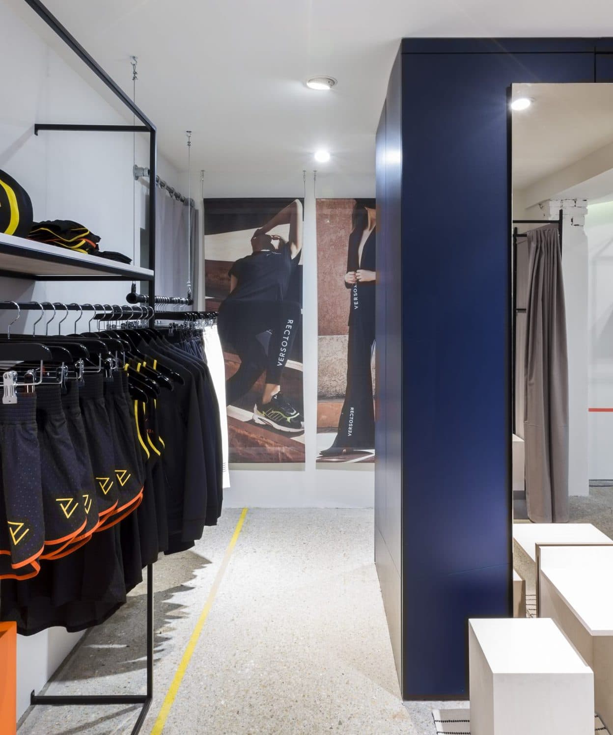
POP-UP STORE
After the launch of the website and first collection – simply labeled Collection One – Nightingale once again went to the drawing board to assist Recto Verso for the launch of their first pop-up store. Handling the interior, strategy and communication of the pop-up, Nightingale shaped the way people would experience the store in real life.
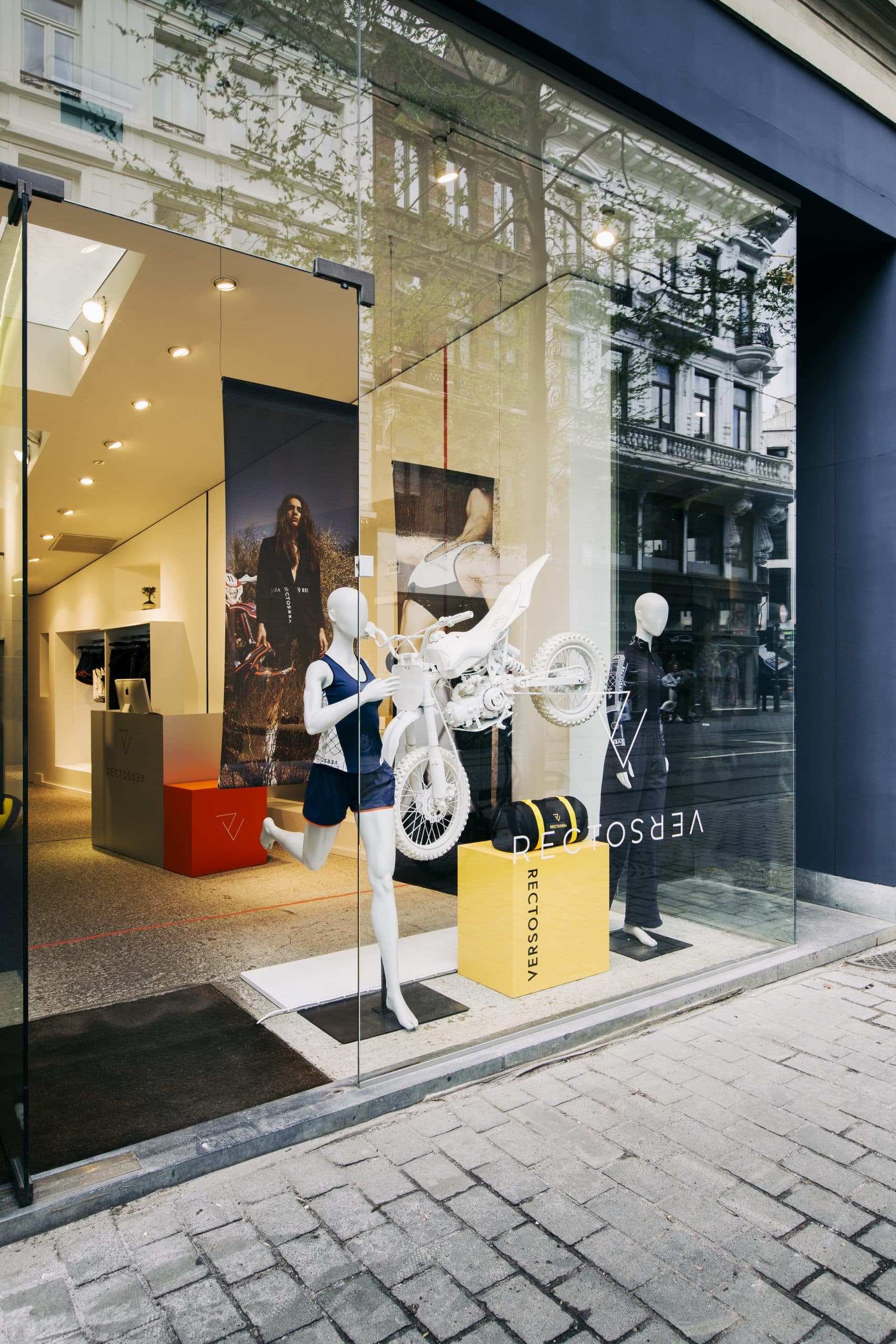
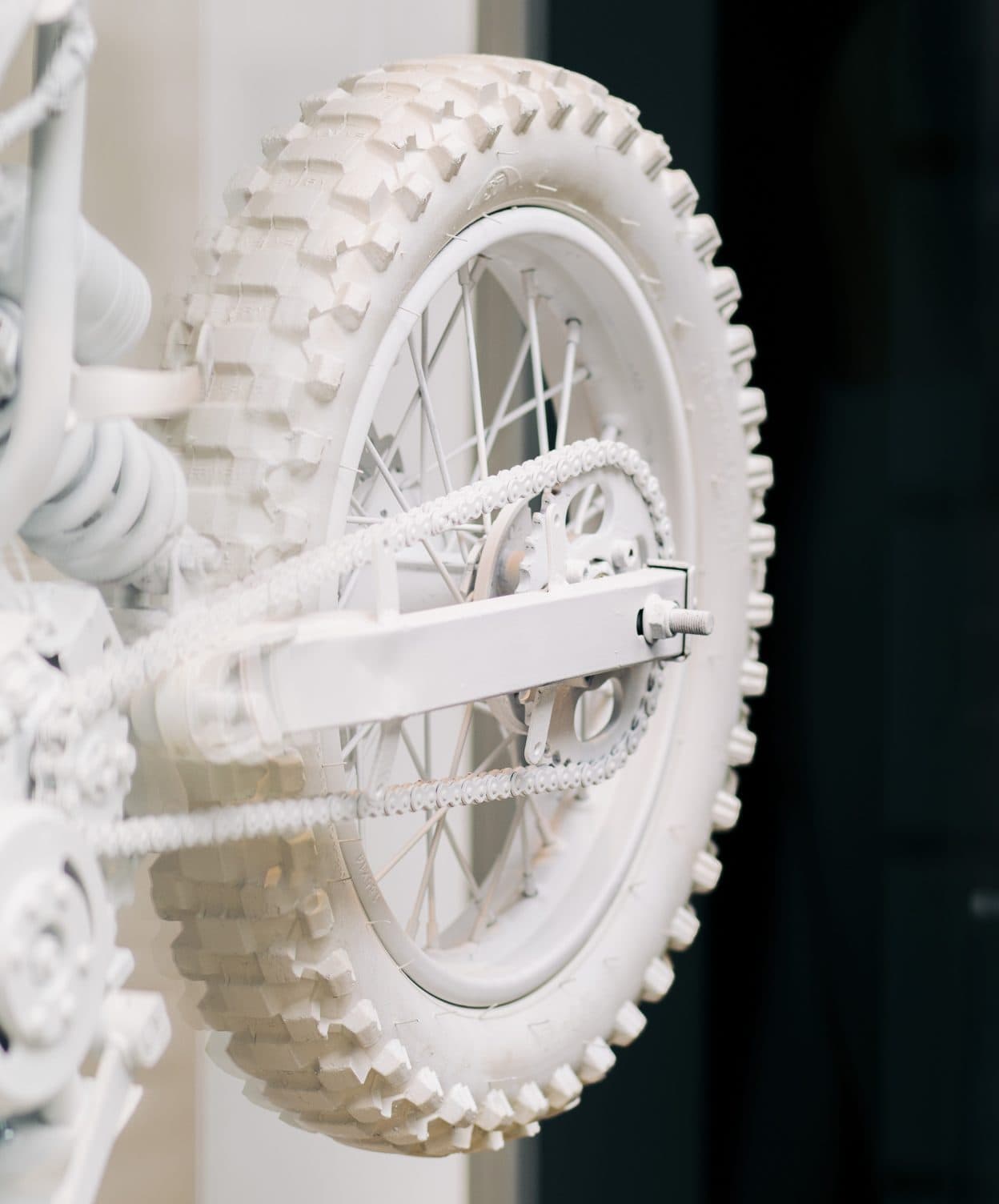
BRINGING THE RECTO VERSO UNIVERSE TO LIFE
In the Recto Verso pop-up store, the duality between sophistication and raw female power, or ‘le chique et le choc’, was translated through several elements in the scenography. Hugely influential in the creation of the brand’s choc side was Camille’s interest in motorsports.
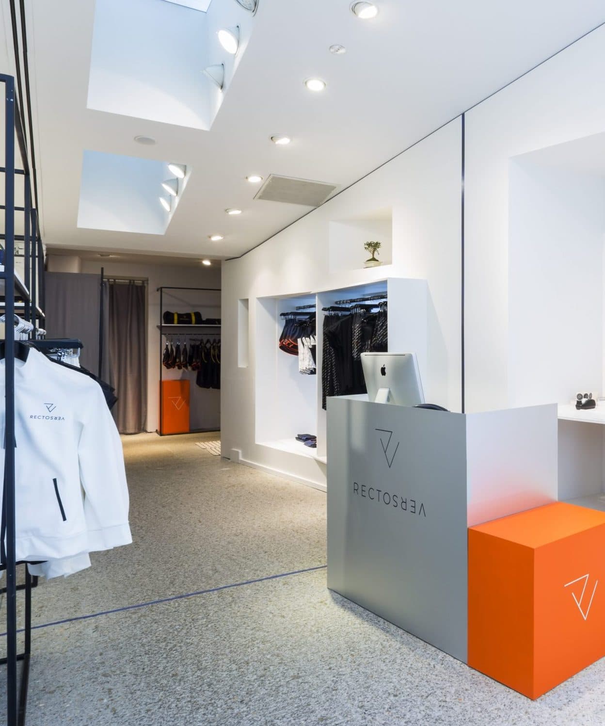
LE CHIC ET LE CHOC
Women balance their sophisticated side with their edgier side on a daily basis. For Recto Verso, this translated to elegant Wabi-Sabi elements like bonsai trees, as well as the floating motorcycle painted entirely in the cod grey signature colour.
SIGNATURE COLOUR PALLET
The store started as a blank canvas, painted cod gray with modern industrial elements added to the painting. Colours used for the retail concept were derived from the brand’s signature colour pallet, sporting the colours true blue, spicy orange and spectra yellow.